

Exploring Violin Plots with Rent Growth Data
A violin plot is an interesting way to visualize quite a bit of information on the same chart, but it also isn’t as intuitive as other types of charts. I thought it might be worthwhile to walk through one looking at average effective rent growth across markets of various sizes from the last twelve months.
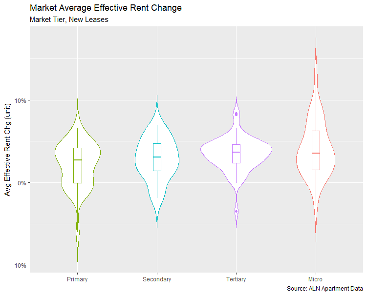
Overall Distribution and Range of Market Tiers
In this violin plot, more than 140 multifamily markets around the country are assigned to one of four market tiers: primary, secondary, tertiary and micro.
Individual markets that make up each group are reflected as a density plot. This is the overall shape of each of the four violins and shows the distribution of the data. The wider areas reflect a higher probability of markets featuring the corresponding rent growth value and narrower areas reflect a lower probability for the corresponding values. For example, we can see the distribution of the Tertiary group is the most heavily skewed toward the middle of the range for rent growth near the median of 3.7%.
Another piece of information violin plots provide aside from the distribution of the data is the difference in range between groups. In this case, market-level rent growth values for the Secondary and Tertiary groups have a smaller range than do the Primary and Micro groups. We get this from looking at the overall height of each of the violins.
That’s already quite a bit of useful information that can be gleaned from just a quick glance at the chart. However, we still have the boxplot inside each violin. The boxplot gives us some additional information about the distribution of the data for each of the four market tiers.
Added Information from Boxplots
Each of the rectangles inside the violins tell us the 25th percentile and 75th percentile values of the data with the upper and lower bounds of the rectangle. The line inside each rectangle reflects the median value of the dataset. One interesting aspect we can see in this chart is that despite the differences in distribution, the median value for each market tier is not widely different. The highest are the smaller Tertiary (3.7%) and Micro (3.6%) groups followed by the Secondary (3.1%) and Primary (2.7%) markets.
Notice also the height of each rectangle. Without the violins themselves, this would be one indicator of the dispersion of the data. A larger rectangle means that the data points are more spread out around the median, whereas a more compressed rectangle means that the data points are more tightly grouped around the median.
The lines going up and down out of the rectangles are the boxplot whiskers. Put simply, they indicate whether there is more of a positive or negative skew to the data. The whiskers correspond to values outside the 25th to 75th percentile range that are not considered outliers. In the case of the Primary group, the whiskers reflect a more negative skew. For the Micro group, the opposite is the case.
Evaluating Outlier Values
Lastly, the boxplot inside the violins will identify any outliers. These are values that are outside the expected range of the data and merit further investigation. They could be legitimate data values with an interesting story behind them, or they are possibly being impacted by an error of some kind in the underlying dataset.
In this case, only the Tertiary group features any outliers – as represented by the three dots inside the violin. The bottom dot corresponds to Fort Myers – Naples. In this case, poor rent performance makes sense given the low average occupancy and aftermath of Hurricane Ian.
The two dots at the top of the violin correspond to Green Bay – Appleton, WI and Moline, IN. These are smaller markets in a region that has done well in rent growth lately due largely to less supply pressure helping to preserve higher average occupancies. Moline ended November with a stabilized occupancy of about 95% and Green Bay – Appleton finished the month at around 98%.
In all three cases, the outlier values appear valid.
I hope this run through was helpful. As you can see, one chart can communicate a wealth of information at just a glance once we know what we’re looking at. If you’d like to learn more about Violin Plots, here’s a great resource to help. Don’t forget to read through our most recent newsletter article Apartment Demand Was a Positive in 2024.
Disclaimer: All content and information within this article is for informational purposes only. ALN Apartment Data makes no representation as to the accuracy or completeness of any information in this or any other article posted on this site or found by following any link on this site. The owner will not be held liable for any losses, injuries, or damages from the display or use of this information. All content and information in this article may be shared provided a link to the article or website is included in the shared content.